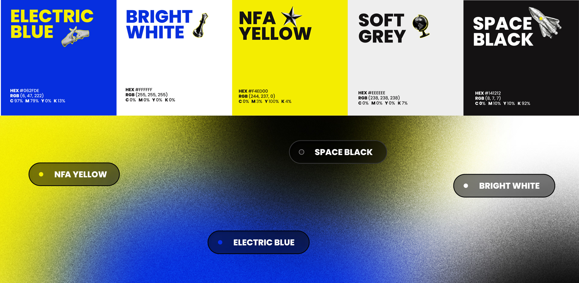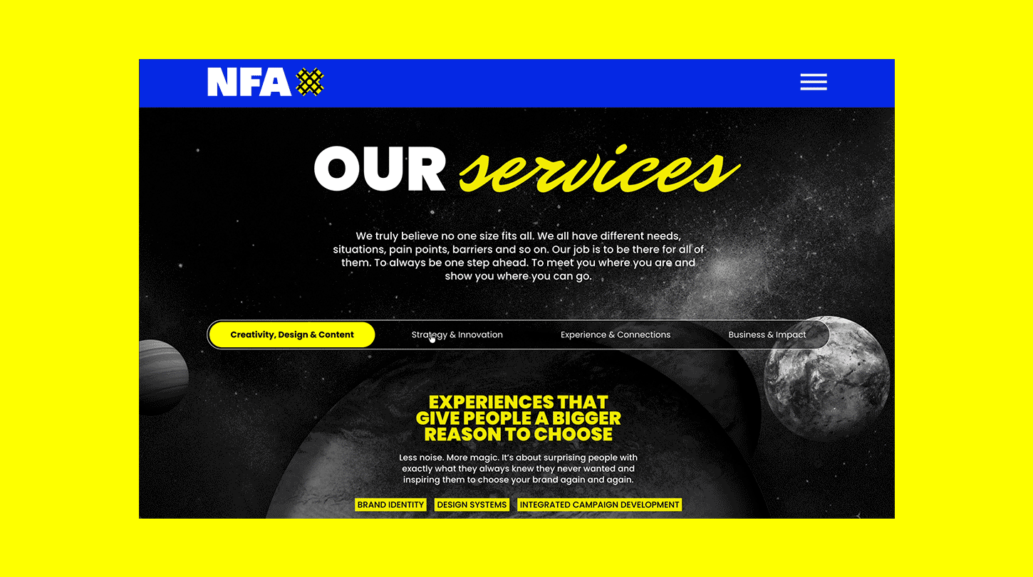
No Fixed Address Inc. (NFA) is an independent, North American advertising agency known for a "no fixed approach" model that specializes in brand identity, digital, and social media. When we approached the brand refresh, our primary goal wasn’t to reinvent who NFA is. It was to honor what has always made it remarkable: its people.
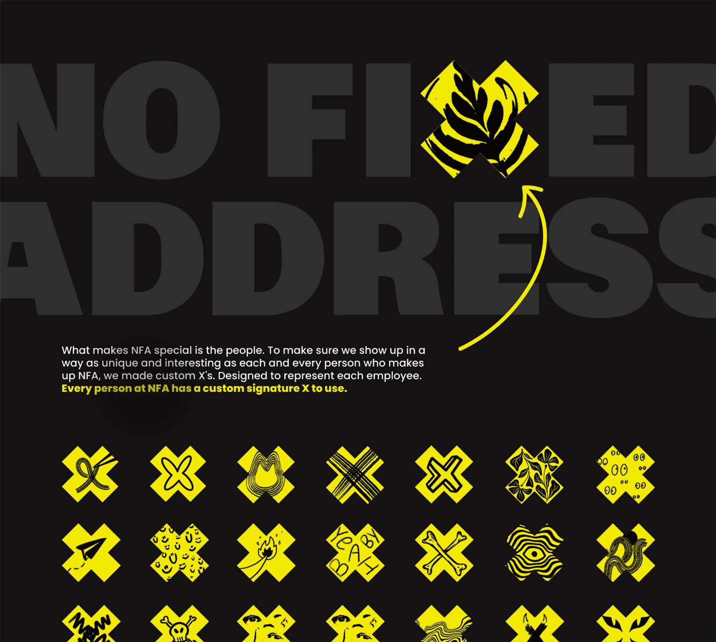
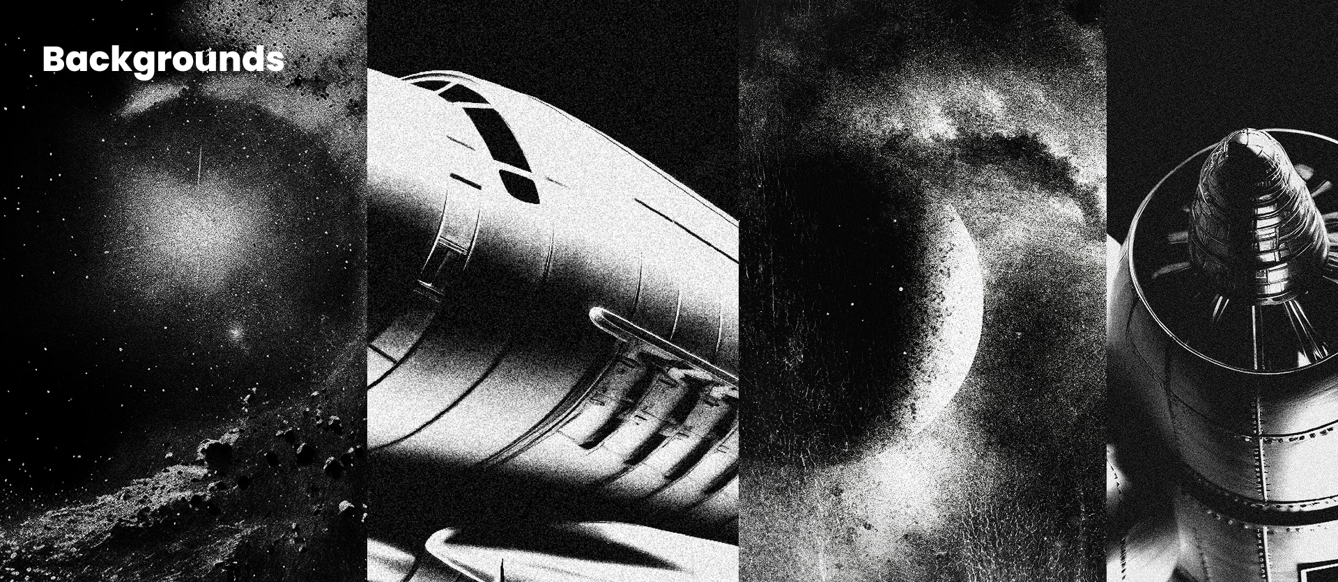
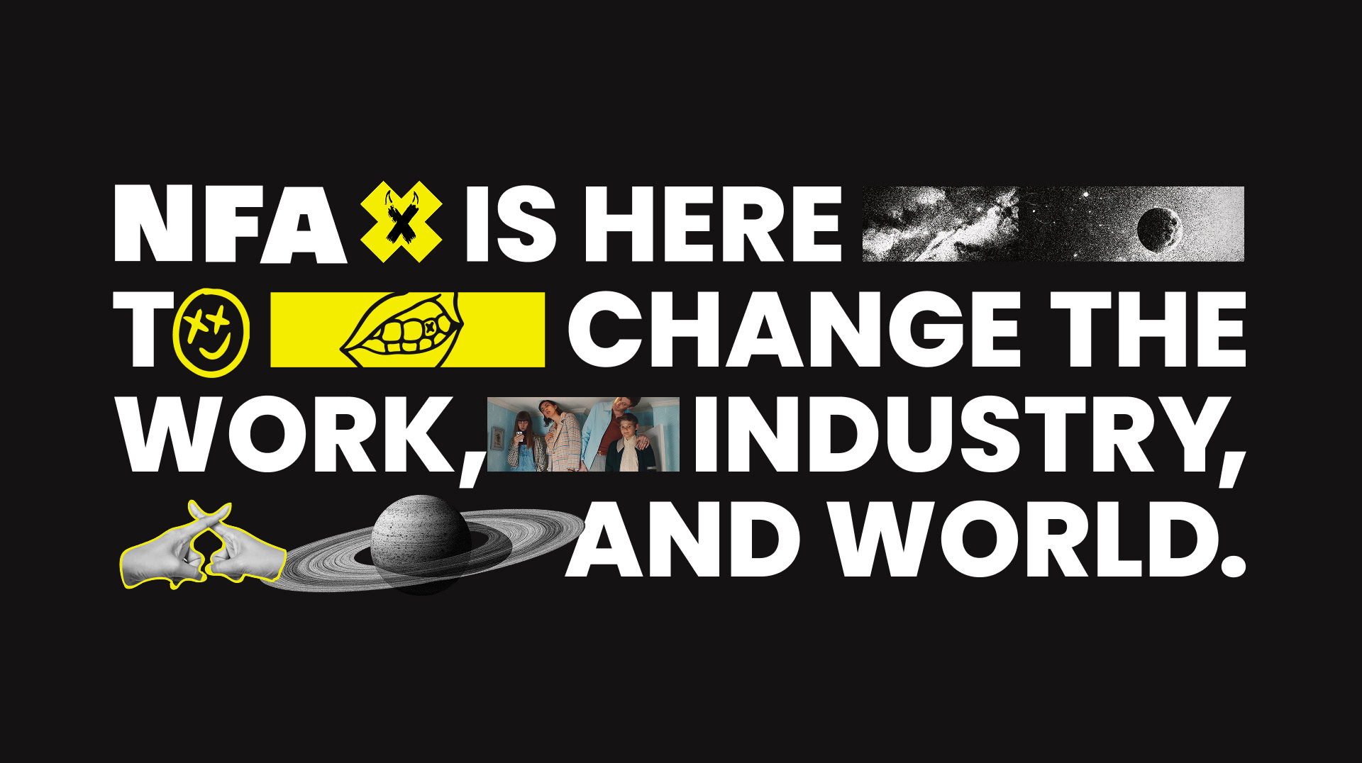
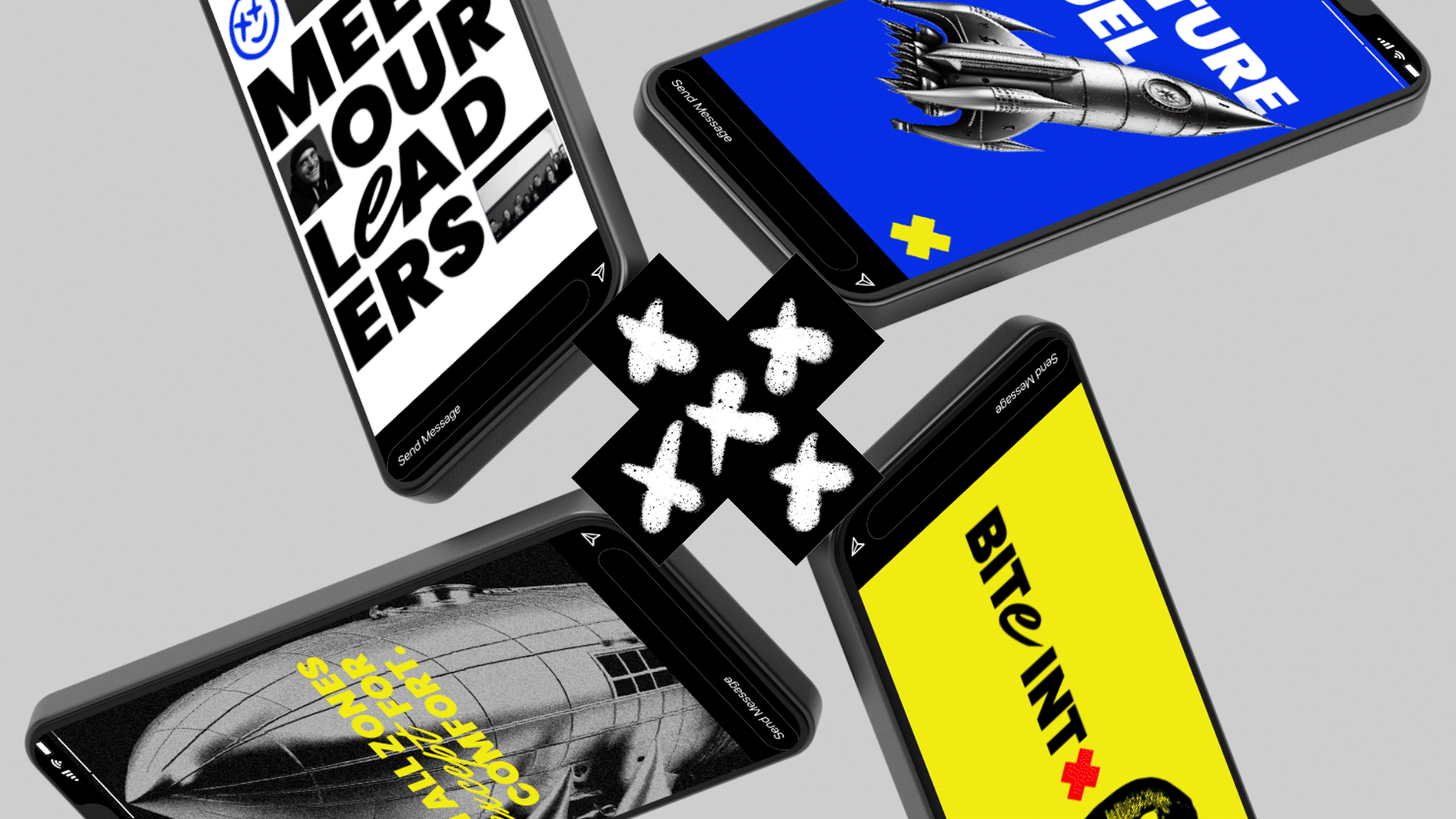
At the heart of the identity sat the existing “X.” We leaned into that equity and built a world around it. We created a fun, quirky, collage-like brand system that celebrates individuality, personality and the work.
The brand design is a tribute to the individuals who choose creativity and curiosity.
The brand design is a tribute to the individuals who choose creativity and curiosity.