Genting Highlands Resort is an integrated resort comprising of hotels, theme parks, massive shopping malls, and equally massive casinos. Just one hour outside of Kuala Lumpur, Malaysia, perched on the peak of Mount Ulu Kali at 1,800m above sea level, the resort is popular for it’s mild cooler weather. Genting is well known for it's great gambling facilities; as part of a continues effort to market their non-gaming attractions, Genting was looking modernize their online experience by redesigning the Genting app and website.
Button and color philosophy
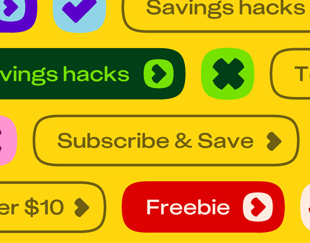
The button shape used through-out the both the web and app are derivative of the logo. We also challenged ourselves to use the Genting red exclusively for liable content.
Boombox
The Boombox is a series of personalize alerts that appear throughout the app based on the users preferences. For instance, if the user has already booked a hotel, the app will push a promotion for a show that aligns with the user's booked hotel dates.
Digital optimization of the loyalty program
Genting has an extensive loyalty program. The membership section of the app allows users to see and track their Genting Points and on-site purchases. The tier points section explains the various membership levels and perks the user can attain through spending and earning Genting Points. The Membership portion of the app also houses the Offer Wallet. The Offer Waller includes various personalized offers based on data from previous purchases and tier status.
My trips
We created a my trips section keeps track of all booked items and builds offers users a timeline of their daily itineraries. Tapping on any of these items, opens up the booked details as well as it's QR code that the user can use onsite. This keeps the entire booking process digital - so no printed confirmations needed.
Part of enhancing the digital experience meant creating micro animations and interactions for the application. We developed an animation philosophy that consisted of three principals. The animation needed to be:
Fun: From Casinos to Theme Parks, Genting Resorts World is fun for all ages.
Fluid: We want the right amount of slick movement and wow factor transitions.
Familiar : Slot machines, drifting clouds, swaying trees… lots of ways to draw inspiration.
For the web, we replicated the same flows created for the app. We developed a modular system which included images rich full width modules, and smaller content modules. Genting has a large social following, we leveraged this by creating a “featured” social module which sits at the bottom of the homepage or hotel pages. This way Genting is able to use UGC on the website to show users the resort from a visitor's perspective. We called it "The view from out guests".
Adaptive booking bar
As users explore the site the booking bar automatically adapts to include the specific hotel, attraction or event they are viewing. It’s designed to reduce friction and increase bookings, as it takes the user directly into the booking flow.
Executive Creative Director: Jason McCann
UX Creative Director: Cameron Ley
Art Director & Designer: Victoria Di Valerio
Senior UX designer: Saabira Vanker
Web Art Director & Designer: Damiern lecocq
Motion design: Jared Cook
Case Study motion design: Diana Rodriguez Medina
Agency: GALE Partners
Client: Resort Worlds Genting
